
Woocomerce Product Category Not Symmetrical In Mobile

Hi,
Recently purchased this theme and I absolutely love it. I'm just about done designing and ready to launch my site. I am however experiencing some issues when it comes to the Woocommerce Product Category section on my Front Page. The products aren't aligning properly when in responsive mode via mobile device. I have 1 product in one row, 2 products in another row, and 1 product in one row, but it is set to view 4 items in 4 columns. It shows such on desktop Can someone please help? I've attached screenshots of what I'm encountering.
Recently purchased this theme and I absolutely love it. I'm just about done designing and ready to launch my site. I am however experiencing some issues when it comes to the Woocommerce Product Category section on my Front Page. The products aren't aligning properly when in responsive mode via mobile device. I have 1 product in one row, 2 products in another row, and 1 product in one row, but it is set to view 4 items in 4 columns. It shows such on desktop Can someone please help? I've attached screenshots of what I'm encountering.
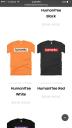
IMG_0767.JPG
1242 x 2208 - 198K

Screen Shot 2016-10-09 at 2.45.49 PM.png
1280 x 800 - 556K
Howdy, Stranger!
It looks like you're new here. If you want to get involved, click one of these buttons!
Comments
Can you please send me (via private message) temporary access to you admin panel because i need to look at this.
With Regards
Daniel
I fixed it on your home page.
There is only one rule in this case, dont use the woocommerce shortcode and use only the post grid.
Screenshot: http://nimb.ws/UXK6oO
With Regards
Daniel
This is beyond helpful.
I think we'll be ready to launch this week.
Thanks again.