
Responsive Help 375px

Hi
I have an issue with portrait display of a section on 375px - my images do not display and the columns should really do the same as at 360px and stack but they are not.
360px is no problem everything mobile portrait above this is not displaying correctly - 375, 414 etc
I tested it all on Elementor but it doesnt show these widths
Im sure its not a theme issue but just wondered if you can offer a quick CSS fix - Many Thanks
I will send page and section link via your contact form.
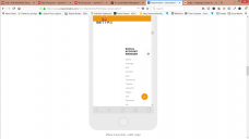
screenshot of issue attached - images missing and column should really stack
Thanks
I have an issue with portrait display of a section on 375px - my images do not display and the columns should really do the same as at 360px and stack but they are not.
360px is no problem everything mobile portrait above this is not displaying correctly - 375, 414 etc
I tested it all on Elementor but it doesnt show these widths
Im sure its not a theme issue but just wondered if you can offer a quick CSS fix - Many Thanks
I will send page and section link via your contact form.
screenshot of issue attached - images missing and column should really stack
Thanks
Screenshot 2019-01-13 11.21.12.png
1920 x 1080 - 174K
Howdy, Stranger!
It looks like you're new here. If you want to get involved, click one of these buttons!
Comments
I see that you have set 160px padding for this column on tablet width and 0px for mobile width.
However, it seems Elementor put these styles in wrong order, and this 0px was overwritten by 160px. Not sure, why it happened in the wrong order.
Anyway, I have added Custom CSS to your section(screenshot). You can copy it to other problematic places.
With kind regards.