
Menu bar increased height with screenwidth <460px

Hi Surgeon,
Another question popped up. When reducing the screen width of the Adamant theme to 460px or less the menubar height increases with 10px. This results in the mobile menu button being below center and the logo being above center, in other words, the vertical alignment is off.
I think this is caused by some inline css that follows the .header-anchor class which sets the height to a variable value (see attached file for a developer tools screenshot). But I can't find the origin of the inline css nor the header-anchor class.
Can you help me to fix this increase of height when reducing screen width?
Thank you very much!
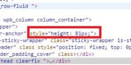
dev_code1.jpg
719 x 142 - 44K
Howdy, Stranger!
It looks like you're new here. If you want to get involved, click one of these buttons!