
Responsive menu BUG

Hello,
the bug is this:
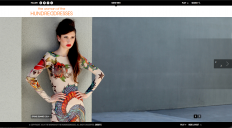
when you shrink the theme in a smaller view, the menu turns into the three line icon, and this is ok.
If you click on the icon to open and close the responsive menu and, after this, you wide the browser to the normal size, all the menu disappear (see the attached file).
The website url is www.thewomanofthehundreddresses.com
Thank you
Notorious
the bug is this:
when you shrink the theme in a smaller view, the menu turns into the three line icon, and this is ok.
If you click on the icon to open and close the responsive menu and, after this, you wide the browser to the normal size, all the menu disappear (see the attached file).
The website url is www.thewomanofthehundreddresses.com
Thank you
Notorious
Menu_Error.png
1280 x 706 - 1M
Howdy, Stranger!
It looks like you're new here. If you want to get involved, click one of these buttons!
Comments
Great, thanks for tip, but call it BUG and even more in capitals is a bit of abuse:-)
Mobile menu is for small devices not for making fun with browser window;-)
However I will take a look.
With regards.