
Two Columns Responsive Issue

Love this theme, but having a bit of trouble!
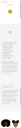
I used the demo template from About Us- Two Columns and I LOVE how it all looks on desktop. But when it's on mobile, it stacks to one column and creates these large gaps (i'm assuming from the additional inner column/padding -- which if changed, affects the look of the desktop view). Mobile also reorders the information, as pictured below.
Is there any way I can have mobile view keep the 2 columns and their respective order? to mirror exactly how it's laid on the desktop? Or if it HAS to stack to one column, is there at least a way to maintain the original order and hide the extra spaces?
Thanks so much for your help!
xx
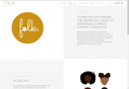
about us desktop.png
1275 x 887 - 99K
about us mobile.png
254 x 1562 - 53K
Post edited by exper669 on
Howdy, Stranger!
It looks like you're new here. If you want to get involved, click one of these buttons!
Comments
Are you sure you want 2 columns in mobile view?
I think there is to much information for 2 columns.
Of course you can try to use two columns, take a look on the screenshot: http://nimb.ws/spxVjY
You must edit these two columns separately and change the default empty values and change it to 1/2
I hope it helps
With Regards
Daniel
Thanks so much!
By sending access to WordPress I mean:
-create new ADMIN account with fake e-mail
-set some password to this account
-send me created login and password
With Regards
Daniel