
Social Icons inside Header Menu on Mobile

1) Is there a way to put the social icons INSIDE the mobile header menu? I've attached a photo of my site on mobile view, where you can see that the social icons make the header height's too long and it cuts into my pages' content. I've attached an example of a different site, wondering if i can do a similar type of thing by incorporating the social icons INSIDE the menu.
2) Is there a way to make sure the header stays to one line, and doesn't wrap? It seems like there's enough space. Thanks!
2) Is there a way to make sure the header stays to one line, and doesn't wrap? It seems like there's enough space. Thanks!
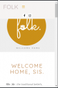
Untitled.png
319 x 486 - 21K

example.png
330 x 622 - 167K
Howdy, Stranger!
It looks like you're new here. If you want to get involved, click one of these buttons!
Comments
But the current design is like this not without reason. You should rather focus on applying custom styles for content main container and add some top-padding when browser goes under particular width.
Please provide an url of your website - I'll send you a little how-to.
All the Best.
there's another solution.
Edit the page with this issue, go to the very bottom, below the editor. There you have see option panel.
Go to 'Header' tab and set 'Hide content under header' to 'Turn it off'
All the Best.
So is there any way to get the social icons to fit on the top line? I've made the logo text smaller and even deleted the 3rd social icon hoping it would fit, but no luck. Content looks great now but it still looks a bit messy having the icons drop down. Thank you so much!
All the Best.
Like surgeon said this is not easy, and explanation you can find here http://support.apollo13.eu/discussion/4333/social-icons-mobile-devices
Based on this linked answer I have prepared for you such custom CSS, specially for your situation: This might look like not much code, but this is pretty new, and not every browser will work with this. Please test it.
With kind regards.