
Mobile view/Footer issue

Hello, so after your recommendations, Im going to leave here my questions.
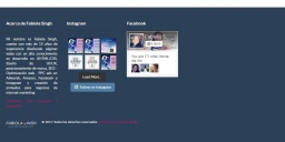
1) I have set in my footer only 3 section on my footer widget, but my web keep showing 1 more slot in the footer, so if I decide to use 4 sections now in my site will show 5 sections on the web, means there is always an empty space on the right side please see image attached, how I can fix this ?
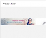
2)my site is using only an image as the main banner and I set this on the properties of the page, but I'm having a problem with the mobile version because it doesn't adjust to the view. if is not possible with the property page option, using the same theme, how I can achieve the same look but responsive
Ill appreciate your help
Fabiola
pd. my site url: www.fabiolasingh.com
1) I have set in my footer only 3 section on my footer widget, but my web keep showing 1 more slot in the footer, so if I decide to use 4 sections now in my site will show 5 sections on the web, means there is always an empty space on the right side please see image attached, how I can fix this ?
2)my site is using only an image as the main banner and I set this on the properties of the page, but I'm having a problem with the mobile version because it doesn't adjust to the view. if is not possible with the property page option, using the same theme, how I can achieve the same look but responsive
Ill appreciate your help
Fabiola
pd. my site url: www.fabiolasingh.com
footer1.JPG
1179 x 525 - 62K
footer.JPG
487 x 301 - 23K
fs-mobile.JPG
407 x 343 - 17K
Post edited by Fabymosa on
Howdy, Stranger!
It looks like you're new here. If you want to get involved, click one of these buttons!
Comments
As for 1) I can't find anything what could be causing this, so if you are interested I can debug it on your site.
Could you please send me temporary access to your WordPress and FTP so I could check there what is going on? Send it here on forum via private message(click on my nick, in top-right corner you will find option "Message"). In message please add LINK to topic it applies to.
By sending access to WordPress I mean:
-create new ADMIN account with fake e-mail
-set some password to this account
-send me created login and password
2) Maybe try using option "Cover" in "How to fit background image" for your title image.
If that is still not what you are looking for, I will try to help you with some custom CSS.
With kind regards.
my web is FabiolaSingh.com
Thanks for reminder now. I will investigate it later and reply.
With kind regards.
If you don't want to change it, then only way is to use cover option, and try to position image with custom CSS for small screens. When you will change it, then I can help with CSS.
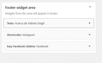
Something got stuck here, cause in code I see there are 5 widgets for this area.
Bonus widgets are:
1. wdi_instagram_widget
2. power_pintrest_feed
Probably something happened with them and now that create this hole. If you still have plugins that created these widgets, then try to activate them and then remove widgets.
With kind regards.
I changed the banner to cover but i think i need some css for the mobile version
I think better way will be for you to redesign these title bars, same as in original superior demo:
1. Create titles as text, either with:
- title bar option http://superior.apollo13.kinsta.com/pages/about-us/
- or with VC elements http://superior.apollo13.kinsta.com/about-us-ii/
2. Use images only as background, so you will not use context when viewing on small screen.
With kind regards.