
Logo Visibility Problem

Hi,
First of all, I need to say that your theme is great! Good job!
I have two problems:
1. Despite the logo is displayed on the main page in the correct way, I cannot see it on the other pages which have white background. I uploaded the white logos (normal + HDR) from the Customize screen but there is no any option to upload the black ones in this screen. (I uploaded them from the Media section.) So where are the other pages getting the black logos from? You can find the screenshots that I took for you in the attachment.
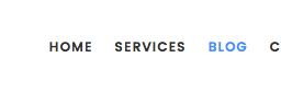
2. I cannot change the ¨highlight color¨ of the menu in the Blog page. (Now it's blue.) Another screenshot is in the attachment.
Thanks,
Fırat
First of all, I need to say that your theme is great! Good job!
I have two problems:
1. Despite the logo is displayed on the main page in the correct way, I cannot see it on the other pages which have white background. I uploaded the white logos (normal + HDR) from the Customize screen but there is no any option to upload the black ones in this screen. (I uploaded them from the Media section.) So where are the other pages getting the black logos from? You can find the screenshots that I took for you in the attachment.
2. I cannot change the ¨highlight color¨ of the menu in the Blog page. (Now it's blue.) Another screenshot is in the attachment.
Thanks,
Fırat

Screen Shot 2017-04-21 at 15.26.21.png
1280 x 88 - 17K

Screen Shot 2017-04-21 at 15.26.45.png
1280 x 87 - 12K
Screen Shot 2017-04-21 at 15.27.27.png
1276 x 84 - 14K
Post edited by whiskeyinthejar on
Howdy, Stranger!
It looks like you're new here. If you want to get involved, click one of these buttons!
Comments
Thanks for kind words.
Answer for logo problem you will find in "header color variants" section http://apollo13.eu/docs/apollo13_framework_theme/#!/header_variant_light_dark
As for Highlight color check option Customizing ▸ Header settings ▸ Main Menu ▸ Links hover/active color
Hope that helps :-)
With kind regards.
Thank you for your swift reply.
I've solved the 2nd problem, thanks.
But still having problems with the logo on the Services, Blog and other pages. I don't want to change color of the menu. I just want to see the logo when its background is white. I mean it should get the black logo somewhere else but it can't. On the demo, you use two different logos in different colors: Black & white.
Am I missing something?
Thanks,
Fırat
Have you checked link I have send you?
Depending which header color variant you use on your other pages you should change it in Customizing ▸ Header settings ▸ Variant light - overwrites ▸Logo image OR
Customizing ▸ Header settings ▸ Variant dark - overwrites ▸Logo image
Also to use this function make sure that you enabled Customizing ▸ Header settings ▸ Logo ▸ Use logos from header variants
With kind regards.
Now I'm having another problem:
The logo seems big and pixelated when I scroll down and stays like that sometimes (when you stop scroll down). Also the bar is thicker than the one in demo. than You can find the screenshot in the attachment.
PS: I tried to upload the normal logos instead of the HDR ones at first but I had the same problem. So I decided to upload the HDR ones for both (ImageUpload an image for logo & Image for HIGH DPI screenFor example Retina(iPhone/iPad) screen is HIGH DPI. Upload an image for logo.). It worked like that. If you just don't scroll down... : )
PS 2: I couldn't switch the header of the Blog section with the way you showed me.
Yes, for sticky header you have to either remove or add logo from
Customizing ▸ Header settings ▸ Sticky header - overwrites ▸Logo image
That is last place where you can add different logo (if you want). If you will remove it from there, then it will use default defined logo.
To change header color variant for blog go to:
Customizing ▸ Blog settings ▸ Posts list
Hope now it will get easy :-)
With kind regards.
Have a good week.
Well, I added the code Custom CSS. On the Home page, it seems OK but I'm still having two problems:
- For all pages: Logo seems small. I uploaded two sizes which are the same size with yours (The HOPE logo). I was using the ¨HDR logo¨ by uploading it to the ¨normal logo slot¨ to be able to see my logo with the size I want, before I added the code. Now what should I do to get the size I want? Which logo/s should I edit and where should I upload it / them to? (In the attachment: Logo.png)
- On the other pages: Still, logo seems bigger and pixelated when I try to scroll down. Also, logo is getting late to disappear and stays on the background. Overlapping 01, Overlapping 02.
Sorry for too much problem.
Thanks.
I don't know why exactly, but for some reason in your case theme didn't generate CSS that should make your logo work proper.
Lets start again.
1. Your current logo can seem small cause you have packed all your image in only half size of image. Half of your logo is just transparent space. "Hope" logo takes all the width of image.
2. Remove CSS I gave you previously.
3. You can easily upload bigger logo if you like, it doesn't need to be same size as ours.
4. You can adjust how much space it will take with padding options for logo(top and bottom).
If you still face issues, then plase post link to your site where issue happens.
In latest update we have changed when when header switches to sticky, so probably you will find it working better there. So try version 1.2.1
With kind regards.
1. Your current logo can seem small cause you have packed all your image in only half size of image. Half of your logo is just transparent space. "Hope" logo takes all the width of image.
I couldn't understand what you meant exactly. The logos that we designed are exactly the same with yours (same space, same width etc).
2. Remove CSS I gave you previously.
OK. I did.
3. You can easily upload bigger logo if you like, it doesn't need to be same size as ours.
I just uploaded the HDR versions for all variants (Logo, Light, Dark, Sticky). In the attachment.
4. You can adjust how much space it will take with padding options for logo (top and bottom).
OK.
I also updated the theme. Now I'm using 1.2.1... But unfortunately, still having the same problem on all pages.
http://crm114.co
http://crm114.co/services/
http://crm114.co/blog/
http://crm114.co/contact/
Thanks,
Fırat
I doesn't matter if this is how you wanted. I added it just for clarification :-)
Now, cause as main logo you have put HDR version, and in header color variants you use smaller version it messed up theme calculations.
Mainly issue with pixelation is now caused by various sizes used in various places.
What is the solution:
1. Best would be to remove all logos(normal, light, dark and sticky variants).
2. Upload Only normal size logo in Customizing ▸ Header settings ▸ Logo ▸ Image and make sure it works/looks good.
3. If it looks good add HDR version in Customizing ▸ Header settings ▸ Logo ▸ Image for HIGH DPI screen to cover High DPI screens.
4. When all works good, then only upload same logo in other colors where needed.
If you don't use other "header color variants" then you don't have to upload there anything. Just upload it to sticky variant if different color is needed.
With kind regards.
Thanks a lot. I solved the problem. Seems like that I forgot to replace one of the logos with the HDR one. All is OK now.
I have two questions more:
- On the Services - Three Columns page, I couldn't find how I should replace / edit the visuals. I checked out the forum and found this: https://nimbus.everhelper.me/client/notes/share/737068/i3dl3t7yh7kx6fvmqzhn It didn't help me because my screen is different.
- On desktop, footer seems OK. But on mobile, I'm having problem. It seems broken. I'm adding two screenshots. Customize.png is from Customize screen (I assume that the right side is turning into mobile (tablet maybe) version when you customize the theme). The other one, Phone - Horizantal is from mobile, iPhone. On mobile, when it's vertical, I'm having no problem.
Thanks.
I would be pleased if next time you will start new topic for different cases, as these things are not connected to logo issue. Thanks!
I think I should tweak CSS for this, cause you are right, it doesn't work best now.
Use this custom CSS to fix it now: Please start new topic for this and describe what you can not change. Screen shot that you have posted explains how to change background image in row.
1. Do you have problem with editing text or background?
2. Which demo did you import?
Please note that we are on week break until 7th May, so reply may come delayed.
With kind regards.