
Photoproof and iPad 7 broken

Any idea why is site broken on iPad 7 on landscape? When is normal position site is ok
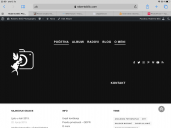
3D2946FD-B6B4-42E9-8AF8-7A21DA89D61A.png
2160 x 1620 - 245K
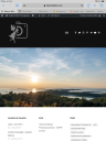
BF2014C8-76B1-4494-AF4B-C12DFA4A853E.png
1620 x 2160 - 2M
Post edited by robi052 on
Howdy, Stranger!
It looks like you're new here. If you want to get involved, click one of these buttons!
Comments
I don't have iPad 7 to test, but I believe it has bigger reported resolution width then older iPads and in horizontal mode it goes into desktop browser breakpoints.
You can achieve similar effect on a desktop browser by narrowing the window.
I can help you either by narrowing your logo for certain resolution widths or by making menu font smaller. What do you think?
With kind regards.
Please try such custom CSS: With kind regards.
Where exactly have you added this CSS, as I can not find it on your website?
With kind regards.
Try now
You can always try to reduce font size even further.
With kind regards.